Core Themedy Features
All our themes comes with an awesome suite of core Themedy features, check them out below!
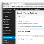
Backend Options and Multiple Theme Styles
Each theme comes with an options panel where you can edit things like slider effects, footer text, theme styles and more. We've kept it simple to unobtrusively integrate into your framework.
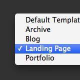
Landing Page Template
All our themes come with a landing page template that lets you create great looking landing pages / squeeze pages. You can set any page to use this powerful landing page template by selecting it right in the WordPress page editor.
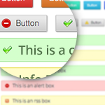
Custom Shortcodes
Using our built in design tool you can create customizable buttons, styled lists, info boxes, quotes and more. It's easily accessible right from the page / post editor in WordPress with a simple point and click interface.
PSD Included
All our themes come with a layered Photoshop file - which means if you hire a designer to customize your site further - you'll probably spend less money and your designer will be able to do their job easier.
Cross Browser Compatible
Themes are tested on all modern browsers like Chrome, Firefox, Safari and IE. We've also ran all markup through validation tools to ensure web standards compliance.